
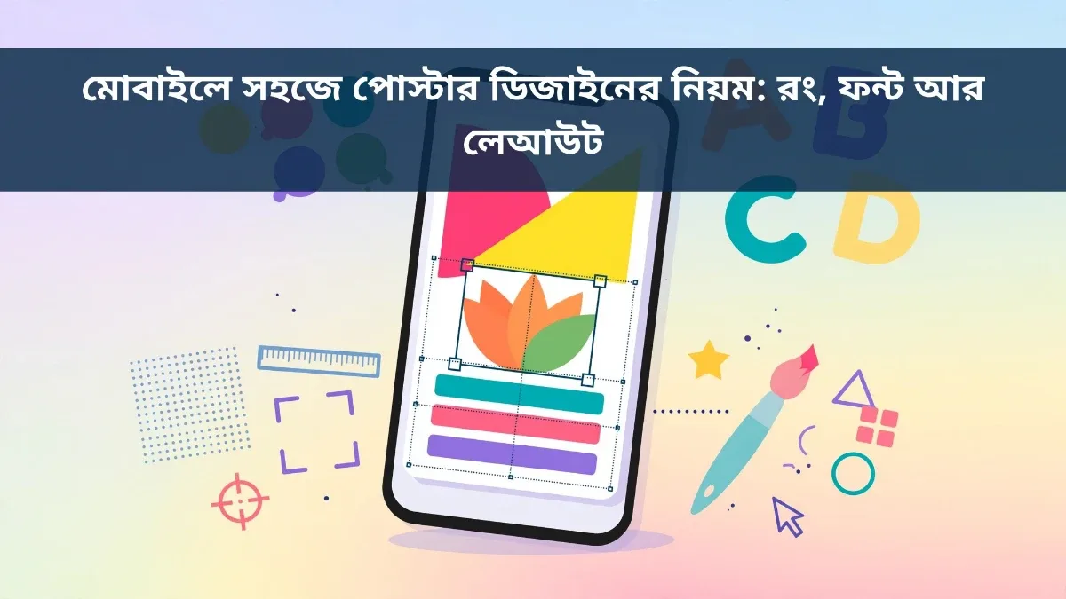
From shop promotions and school events to social media posts and birthday wishes, posters are everywhere today. Previously, designing a poster meant using a computer and heavy software, but now you can create great-looking posters right on your smartphone. Still, simply opening an app and dropping in text is not enough. Mastering three essentials—color, font, and layout—is what makes a poster catch the eye and stick in people's minds. Follow this step-by-step guide to learn mobile poster design from scratch.
1. Define the Poster's Purpose First
Before you start designing, decide who the poster is for and what message you want to share. A store discount poster and a school cultural event poster should not look the same. When your goal is clear, picking colors, images, and text becomes much easier. Write your main message in one short line—such as "20% Off Eid Sale"—and make that the largest, boldest element on the poster, placing supporting details smaller underneath.
2. Simple Rules for Choosing Colors
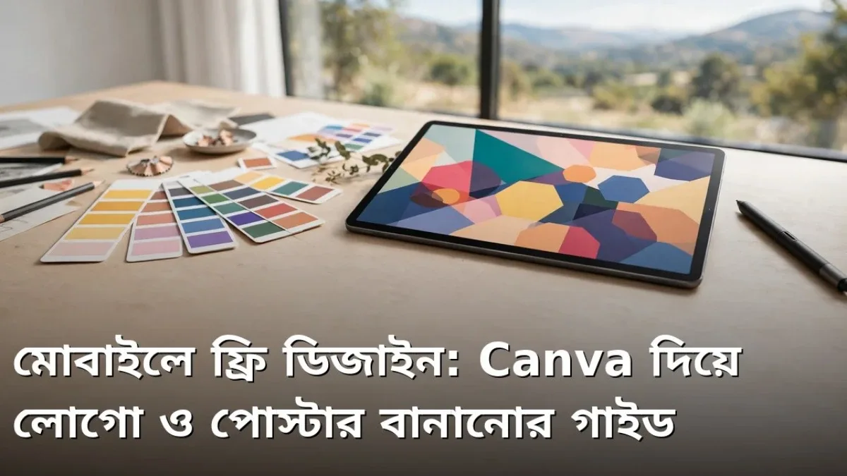
Color is what draws attention first. A well-designed poster typically sticks to two or three colors—using too many makes it look cluttered. Pick one primary color and one or two complementary shades. Make sure your text contrasts clearly with the background: dark text on a light background, or light text on a dark background. Bright colors like red, yellow, and orange grab attention for special offers or urgent announcements, while blue, green, and gray suit calmer, professional designs.
3. What to Keep in Mind When Picking Fonts
Readability is everything in a poster. Never use more than two different fonts in a single design. Choose a bold, large font for the headline and a clean, simple font for the details. For Bengali text, font selection matters even more, since poorly supported fonts can break conjunct characters and hurt legibility. Your headline should be readable from a distance, and smaller text should be effortless to read up close.
4. Layout: Guiding the Viewer's Eye
People naturally scan a poster from top to bottom, so place the most important information near the top and arrange supporting details below. Balance your images, headlines, and text evenly—crowding one side while leaving the other empty makes the layout feel lopsided. Keeping the main subject centered with secondary details neatly arranged around it creates a clean visual flow.
5. Using Photos and Icons Effectively
A strong image is worth a thousand words. Use sharp, high-resolution photos that directly match your topic—stretching small or blurry images ruins the design. One large, clear photo works far better than crowding several small ones. Keep icons minimal too: a phone icon next to a contact number or a location pin beside an address helps viewers scan information at a glance.
6. Why Whitespace Matters
Many beginners think filling every inch of a poster makes it look better, but that is a mistake. Leaving open space around text and images lets the design breathe and makes it much easier to read. Whitespace naturally guides the eye toward key details, and giving your headline a little breathing room helps it pop. Intentionally leave some empty space when arranging your elements.
7. Designing with Mobile Apps
Plenty of user-friendly mobile apps make poster design effortless. They offer ready-made templates where you can simply swap in your own text and images. Beginners can start with templates and gradually customize layouts as they gain confidence. Built-in color palettes, font libraries, and stock photos make the process even smoother.
8. Keep Text Short and Clear
A poster is not a book, so less text is always better. Highlight your main message in large type and keep everything else brief. Skip long sentences in favor of short, scannable lines. Double-check that dates, times, addresses, and phone numbers are crystal clear so no one misreads them—and proofread carefully before finishing, because typos instantly lower a poster's quality.
9. Review Your Design Before Publishing
Do not publish your poster the moment you finish it. View it zoomed out on your phone and also from a few steps away to confirm the main message is still readable at a distance. If possible, ask a friend for quick feedback. Check that colors look right, no text is cut off, and every detail is accurate.
10. Practice and Keep Learning
Becoming a good designer takes regular practice. Look at great posters every day and ask yourself why they work—is it the color palette or the layout? Over time, you will develop your own style that makes your designs stand out.
Final Thoughts
Designing posters on your phone is no longer difficult—all it takes is a clear purpose, well-matched colors and fonts, and a tidy layout. Following these simple rules will help you create eye-catching, polished posters. Mistakes are normal at first, but your skills will sharpen with every design—open an app today and try creating your first poster.
Discussion & Comments (0)
No comments on this post yet. Be the first to comment!